CHALLENGE:
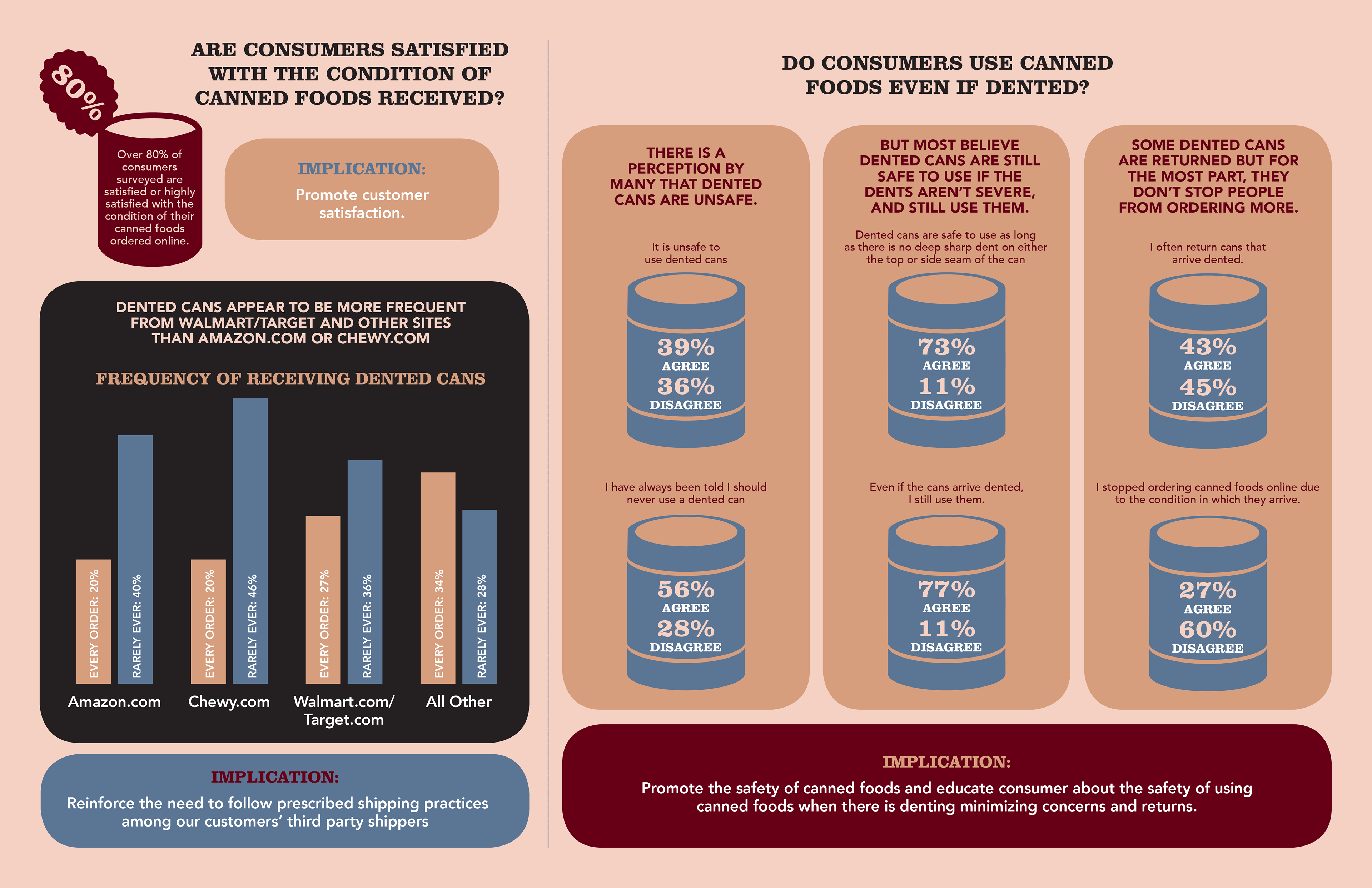
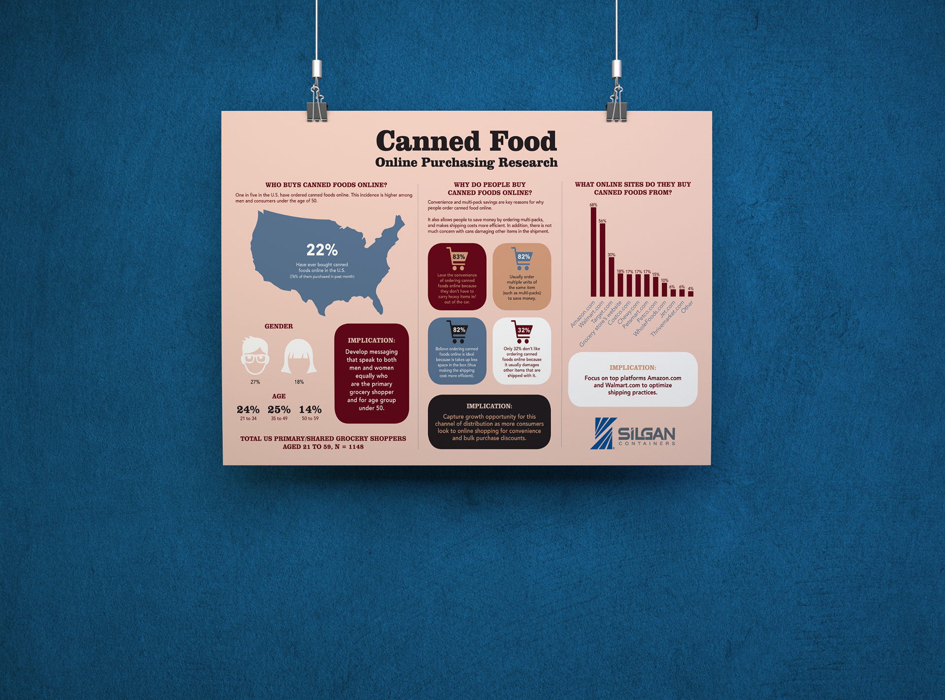
A client seeking to better understand where consumers bought canned food asked me to help illustrate the results of a survey conducted on online purchasing.
A client seeking to better understand where consumers bought canned food asked me to help illustrate the results of a survey conducted on online purchasing.
SOLUTION:
I used a muted color palette to keep the look of the poster consistent. It was important to play with visual hierarchy to make this mundane information eye catching and more interesting. This way, marketers will better understand how to better reach their audience of consumers.
I used a muted color palette to keep the look of the poster consistent. It was important to play with visual hierarchy to make this mundane information eye catching and more interesting. This way, marketers will better understand how to better reach their audience of consumers.