CHALLENGE:
Spring Theory needed a way to communicate all that they have achieved in terms of helping companies find solutions to their challenges as well as show universities just how valuable their program can be.
Spring Theory needed a way to communicate all that they have achieved in terms of helping companies find solutions to their challenges as well as show universities just how valuable their program can be.
SOLUTION:
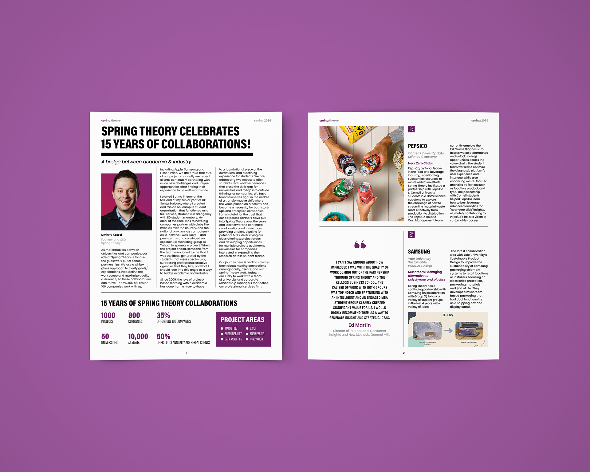
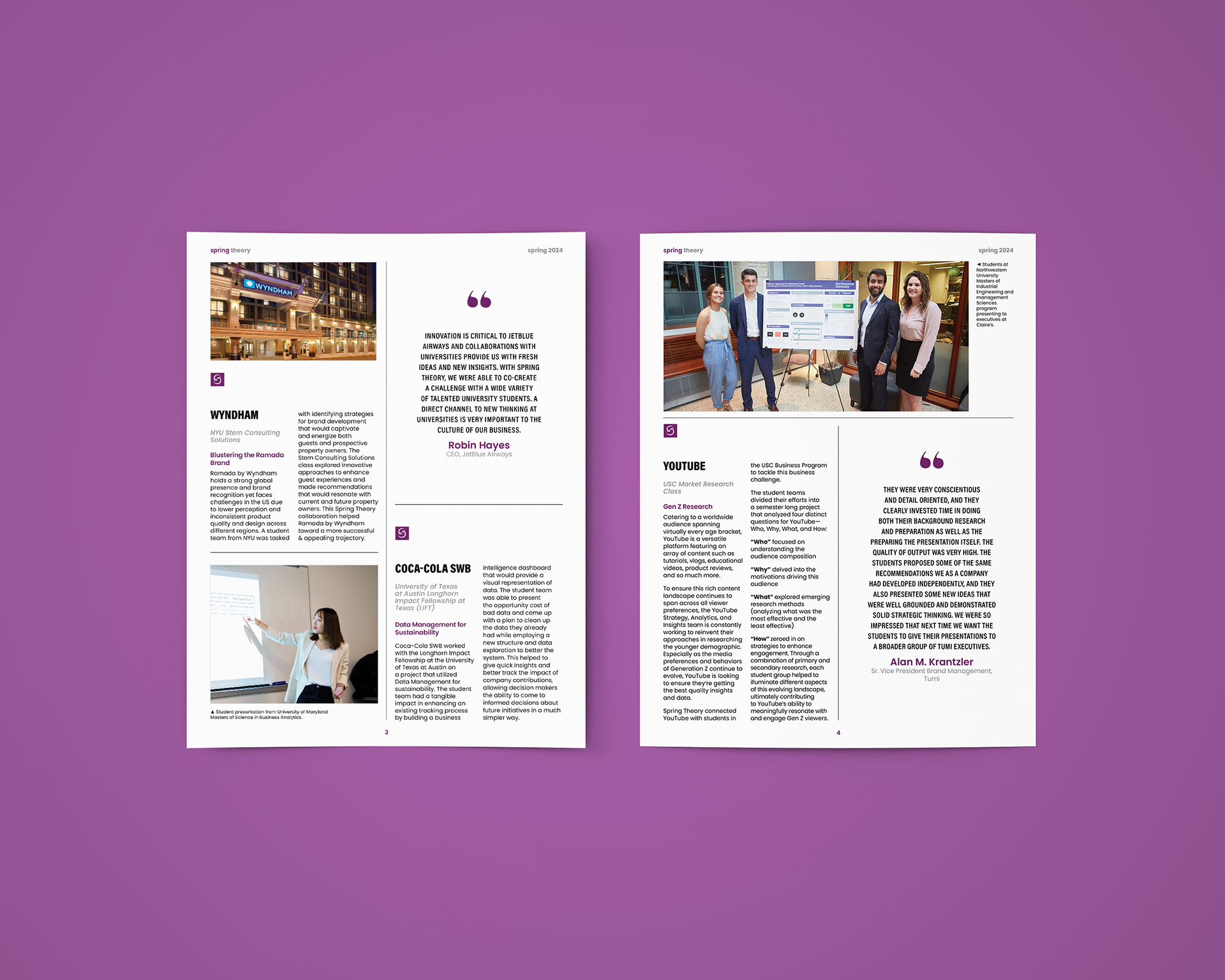
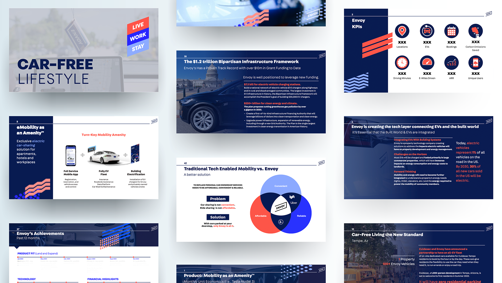
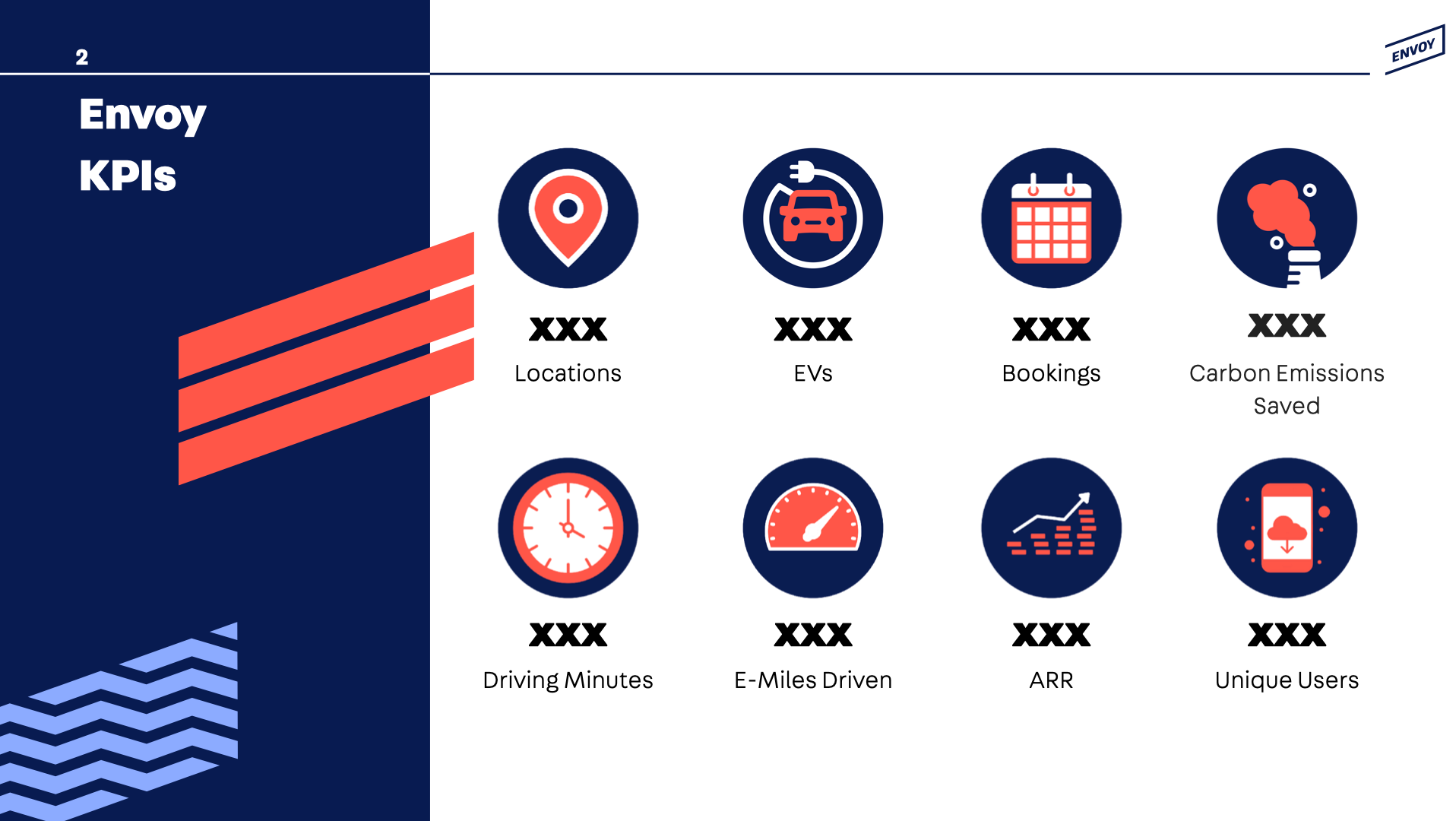
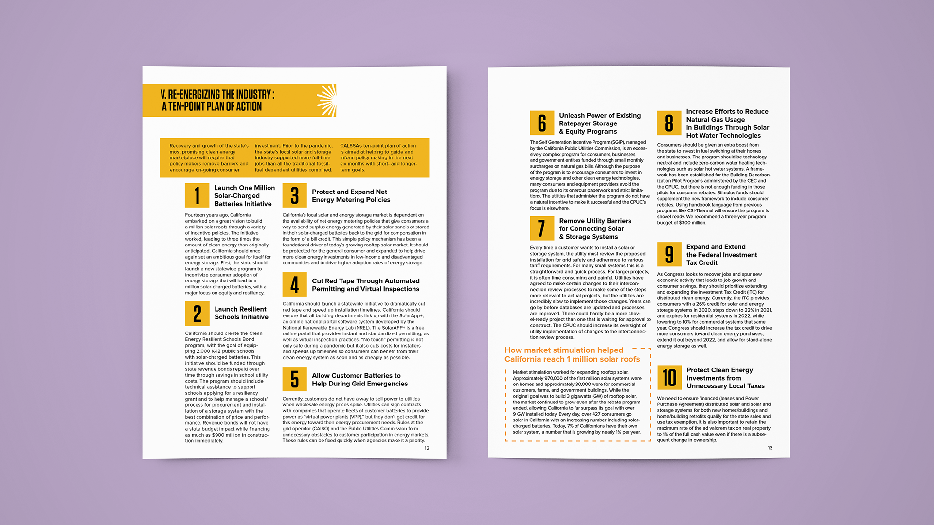
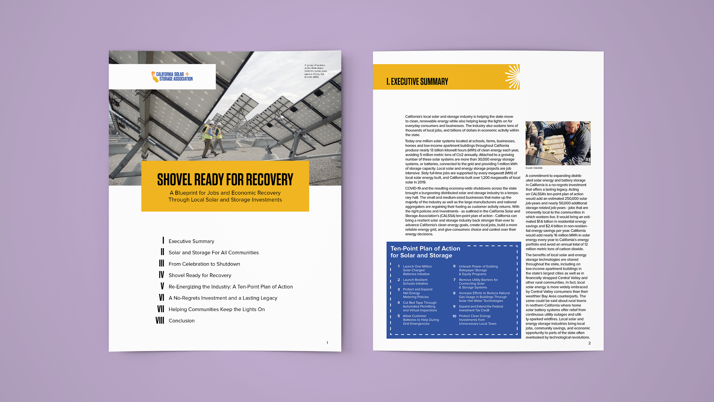
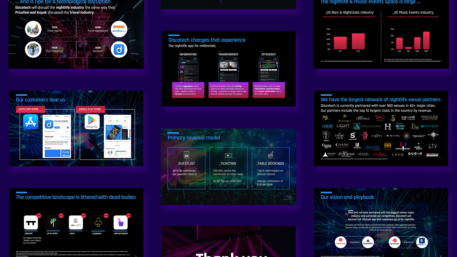
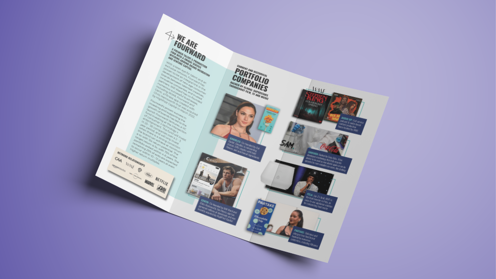
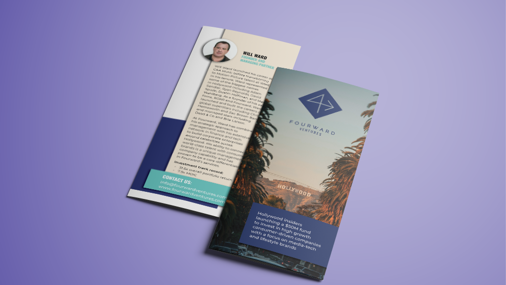
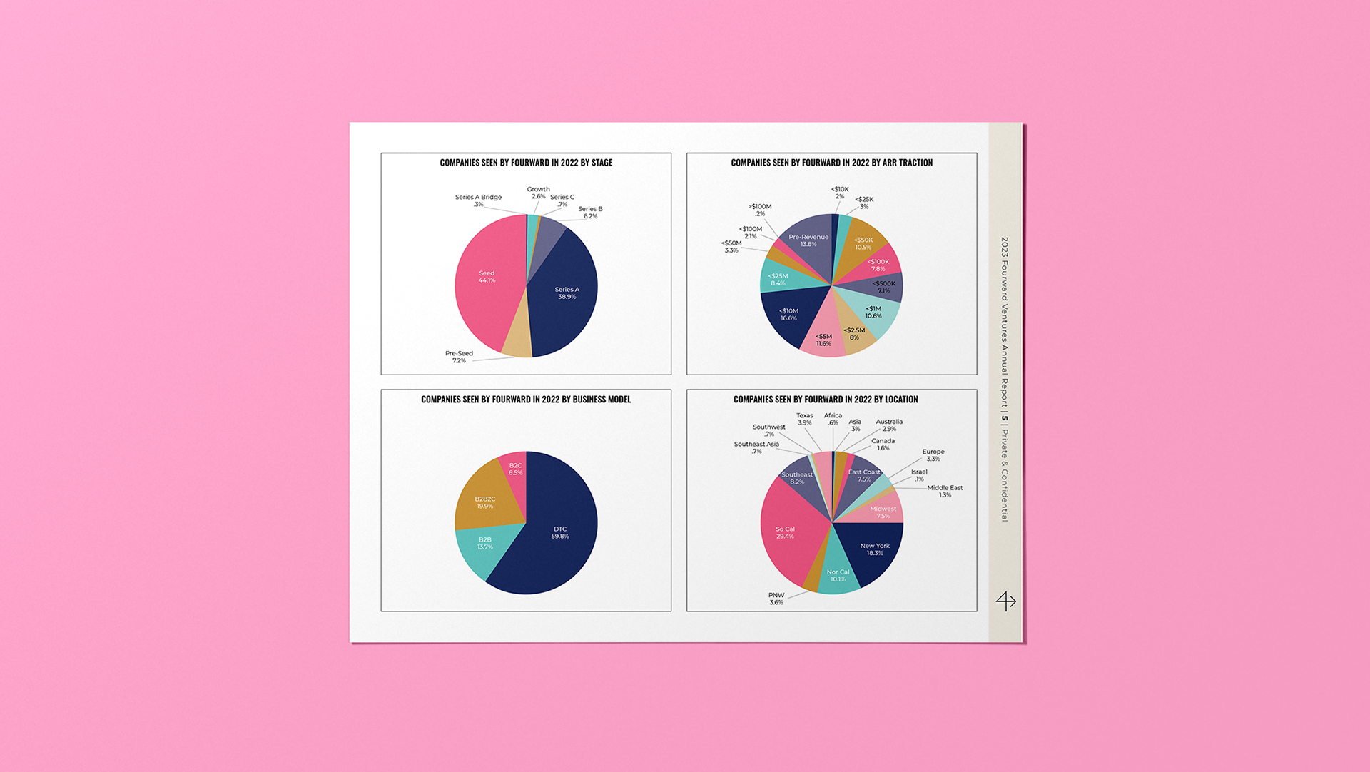
The idea for the Spring Theory newsletter was to use clean lines and let the information hierarchy act as design elements. Using the brands colors, I created a style for each element: the stats; the quotes; the project summaries. I then paired the elements with large scale photography and gave the pages texture with use of different font weights and colors to reflect attributions, titles or captions.
The idea for the Spring Theory newsletter was to use clean lines and let the information hierarchy act as design elements. Using the brands colors, I created a style for each element: the stats; the quotes; the project summaries. I then paired the elements with large scale photography and gave the pages texture with use of different font weights and colors to reflect attributions, titles or captions.
